Visualizing Social Networks II: Facebook
by eric
Part 2 of 3.Ā Return to Part 1.
As with LinkedIn, the graph of friendships in Facebook generally corresponds to relationships established in the real world.Ā Due in part to its more broad-based entertainment appeal, Facebook presently has about six times more registered and active users.
I joined Facebook in early 2004 while I was in college, and over time membership (if not regular participation) on the site has become essentially universal among people of my age cohort.Ā The network graph accordingly provides an excellent mapping of the offline social networks I participated in at these times.Ā However, my Facebook friendships generally do not include some important communities, particularly my family and my work colleagues.Ā While many of these people now have Facebook accounts, Facebook friendship has not been a natural outgrowth of these relationships.
Facebook doesn’t provide a native tool like LinkedIn’s InMaps to plot friend networks, and no third-party applications are particularly popular.Ā Instead, I used the Facebook plugin netvizz to export my data and plotted it myself using Gephi.Ā (This presentation provides instructions if you’d like to do so yourself.)
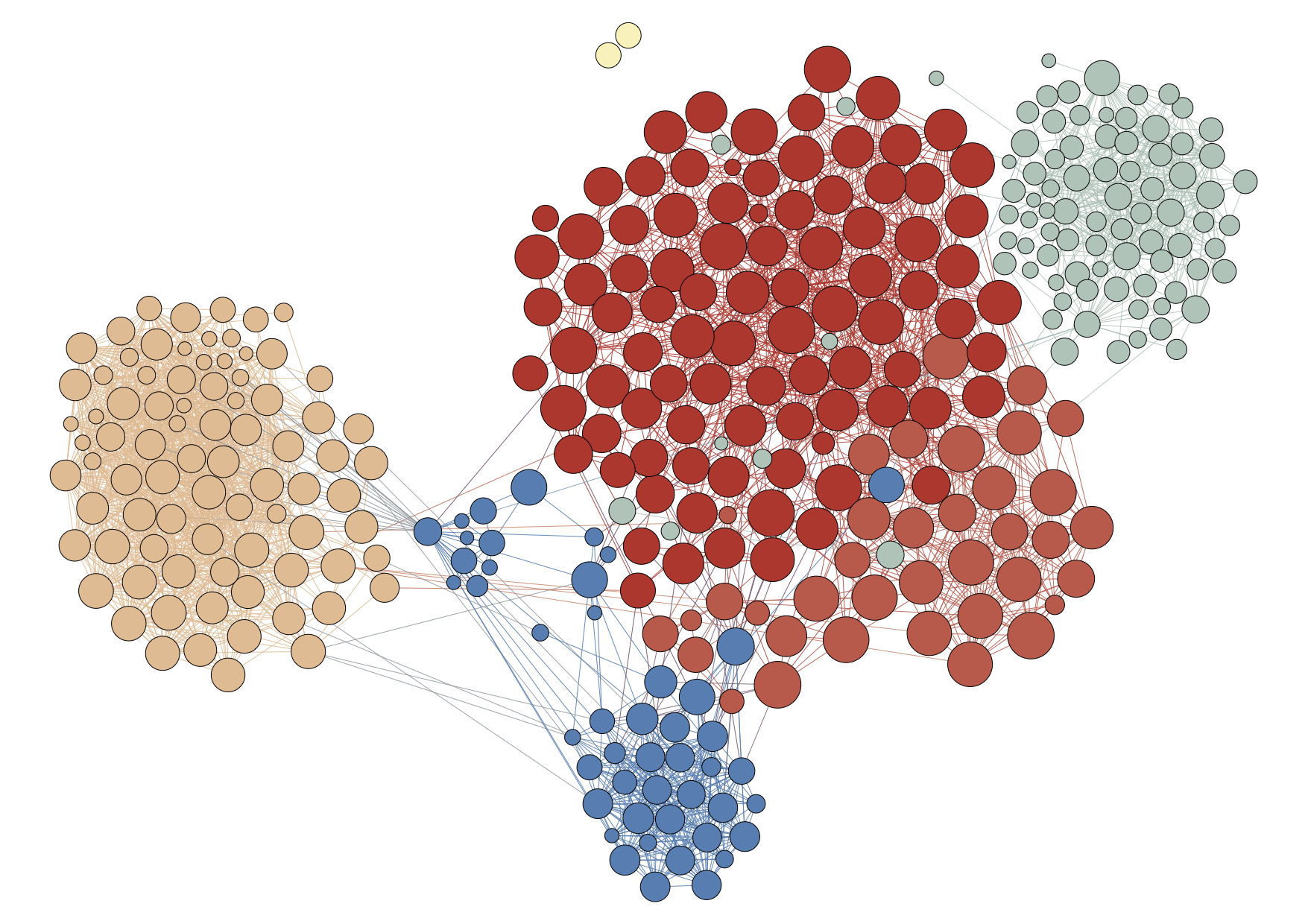
In this first plot (large png; pdf), I’ve used Gephi’s Force Atlas layout algorithm to pull together those friends who are most tightly connected through mutual friendships.Ā This functions to reveal sub-communities within the network.Ā I’ve also used Gephi’s modularity function to attempt to identify and color these cliques.
While I have not plotted the names for privacy reasons, Gephi quite accurately detects the communities here.Ā Red points are my college friends; red-orange are from a college club.Ā Green points are high school friends, hometown folks, and family.Ā Blue points are grad school classmates, and peach are members of a grad school club.
The size of the nodes in this plot scale with the age of the account; as expected, my college friends (red) have the oldest accounts, while the newest accounts are generally hometown/family (green).
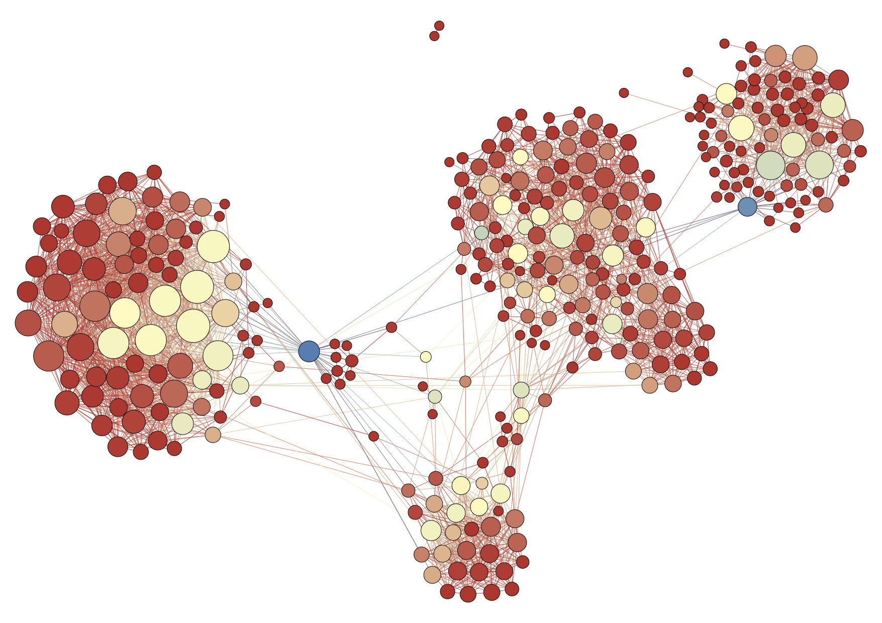
Note that while I have not plotted my own node here–since I’m by definition connected to everyone–the vast majority of my friends have other friends in common.Ā (A pair of friends from a summer program form a separate subgraph, and I’ve omitted the few people who are only connected to me.)Ā The mathematical description known as “betweenness centrality” describes how likely a given friend is to connect two other friends by the shortest path on the network.Ā Another measure, the degree of any given node, specifies how many total friends that person has in the network.
I plot these values in a second plot (large png; pdf) below, where the size of the nodes now corresponds to degree and the color to betweenness.
Underlining the distinct separation between the communities, the highest-degree nodes are central to certain cliques–e.g., the officers of the grad-school club.Ā (Degree is thus correlated with closeness.)Ā Two individuals (in blue) are the most significant in terms of betweenness: my fiancķe and my younger brother, who connect my grad school circles to my hometown.Ā A few other green individuals can be identified as casual friends who have moved between cliques, particularly from college to grad school.
Basic graph analysis on real-world social network data can thus identify key individuals and communities.Ā Note that the dataset that Facebook itself has is far richer, containing records of interactions (photo tags, wall posts, comments, etc.) which may be used to trace the strength of a relationship through time.
Continue to Part 3.


[…] Exploring the Data Universe Skip to content HomeAboutContact ← Visualizing Social Networks II: Facebook […]
[…] Exploring the Data Universe Skip to content HomeAboutContact ← Python for Astronomy Follow-Up Visualizing Social Networks II: Facebook → […]