Visualizing Social Networks III: Twitter
by eric
Part 3 of 3.Ā Return to Part 2.
The Twitter network differs from Facebook and LinkedIn because it does notĀ require relationships to be reciprocal.Ā Accordingly, I can follow users whose updates I find interesting or valuable without any expectation that they will do the same.Ā (In network parlance, this creates a “directed” graph, in contrast with undirected graphs with symmetric links between members.)Ā Twitter’s structure enables efficient one-to-many broadcasting (@ladygaga and @justinbieber have more than ten million followers each), fueling its growth as a platform for breaking news.
I started using Twitter only earlier this year.Ā Since I get updates about my real-world friends through Facebook, the network of people I follow on Twitter is essentially a map of my interests.Ā It’s an incomplete interest graph, as key players in many fields outside of the Twitter triumvirate (tech, news, celebrities) don’t use it as a channel for sharing new information.
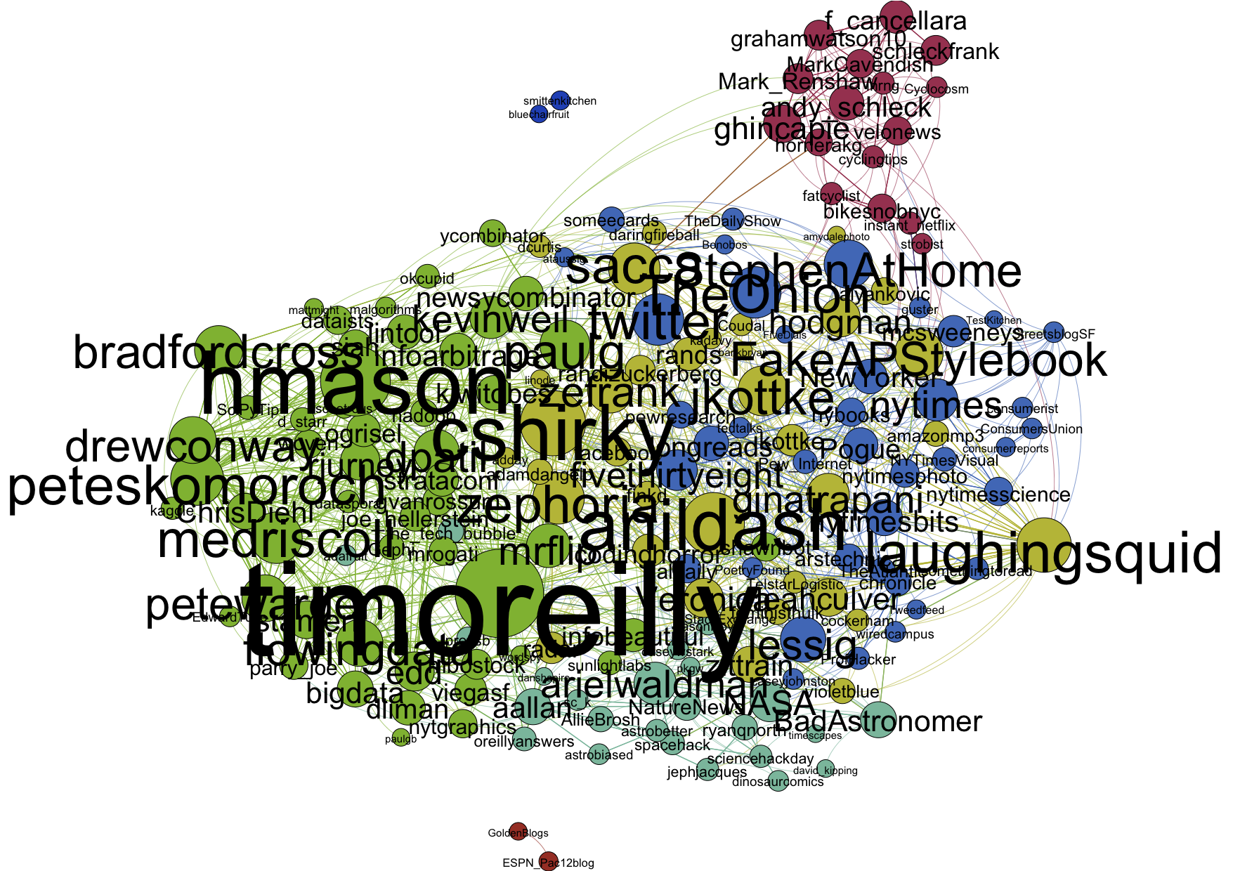
Extracting follower information from Twitter requires a bit of effort, starting with creating a registered OAuth application.Ā However, the API provides access to network information for all (non-protected) users.Ā I combined the excellent code of Drew Conway and Edd Dumbill to build connections among people I follow.Ā The resulting Gephi plot follows (large png; pdf).Ā Since these connection data are public, I’ve included the usernames1.
Since this is a directed graph, I’ve plotted one-way relationships with curved lines and mutual connections with straight lines.Ā The size of the node and the username indicate the relative number of followers of the user within this network.ĀĀ Publisher Tim O’Reilly (@timoreilly) stands out as a major influence on this crowd.
Again, I’ve used Gephi’s modularity routines to locate and color different communities.ĀĀ I’d identify them as follows:Ā data science (green), general tech (yellow), general news (blue), astronomy and webcomics (teal), and pro cycling (maroon).Ā The two disconnected components are food and Cal football.
While Gephi identifies the topical communities within this network, what strikes me is how compact the network is compared to that of my Facebook friends2.Ā Geography and time constrain real-world friendships, while ideas and influence can flow freely through Twitter.Ā The challenge is to extract meaningful signal from the stream using one’s finite attention3.
- Note, then, that it’s possible to build graphs like this for any unprotected user on Twitter. ↩
- Although it seems only @kevinweil, @sacca, and I are interested in pro cycling. ↩
- Hillary Mason (@hmason) algorithmically filters her Twitter stream to maximize the signal-to-noise ratio. ↩

[…] Exploring the Data Universe Skip to content HomeAboutContact ← Visualizing Social Networks I: LinkedIn Visualizing Social Networks III: Twitter → […]