Visualizing Social Networks I: LinkedIn
Part 1 of 3
Humans are ubiquitously social animals.Ā Even our identities are socially informed: when asked to describe ourselves, many of us would mention familial relationships (“a husband,” “a mother,” “a sister”), the culture we are from, or the professional community implied by our work.Ā John Donne’s famous quote “No man is an island” (from his Meditation XVII) evokes this rich interconnection.Ā Networks form from friendships, work relationships, academic citations, web links, email and phone communications, and many other relationships.Ā Today, many social networks—with and without “real-world” analogues—are present online.
Social network analysis provides insight into such communities.Ā Using a detailed view of the relationships (“edges”) between individuals (“nodes”),Ā mathematical tools enable one to assess the how tightly-knit the network is, identify influential or anomalous individuals, and find smaller communities.Ā Network analysis is widely used in the social web to increase the relevance of the information displayed to us (e.g., Facebook’s EdgeRank).Ā However, today both the tools and the network data themselves are also available to non-professionals.
In this three-part series, I generate and compare network plots for three social networks in which I participate: LinkedIn, Facebook, and Twitter.Ā As we will see, even the basic step of making network maps allows us to make inferences about the potential utility of the networks.
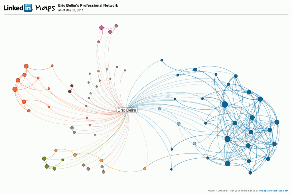
I joined LinkedIn earlier this year as I completed my PhD, and my network on it is not large.Ā However, the network size is in this case not a function of how long I’ve used the network.Ā LinkedIn’s data science team is outstanding, and their People You May Know feature rapidly identified my contacts.Ā However, there are presently not very many people I know using the service.
The plot above is known as an “ego network,” potentially because it makes me look like the most important person in it.Ā It consists of me, all my contacts, and the connections between those contacts.Ā I generated this map with LinkedIn’s InMap feature.Ā (It’s not possible to extract this data, as the LinkedIn API does not give access to one’s contacts’ connections.)
In contrast with the Facebook graph to come, the LinkedIn graph is sparse, with one large and several smaller, weakly-connected cliques.Ā InMaps has attempted to identify communities within the data, coding them by color.Ā Here, the names of my contacts are removed for privacy, but the large blue clique is friends of mine from a graduate school club.Ā Except for a handful of family and hometown friends, the remainder are my college friends.Ā However, there are not enough intermediate ties between them to join them in a single clique.Ā This LinkedIn graph is essentially a subset of my Facebook graph, where we will see more distinct clustering.
Networking for job-seeking famously depends on weak ties, and LinkedIn is set up to provide introductions to people through your connections.Ā The representation of my social circles in LinkedIn is small, however, limiting the reach of the network.
(This basic “look!Ā there’s a clique!” analysis is less data science than force-directed pastafarianism, but it’s the first step for a beginner on the journey to more quantitative analyses.)
Continue to Part 2.


